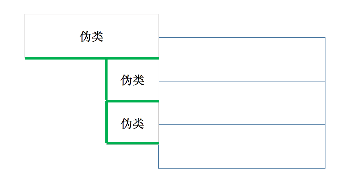
as shown in the UI diagram, there is a dividing line between the first-tier category and the second-tier category, the second-tier category and the third-tier category, and the dividing line between the two second-tier categories increases with the number of third-tier categories under the above second-tier category.
is there a better layout for this kind of dividing line? The project uses react + antd-design. Thank you in advance

