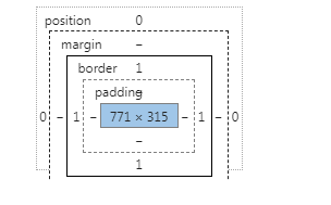
the height of the selected text in the diagram is supposed to be level with the bottom edge of the number "2", right? Why are there so many gaps?

the height of the selected text in the diagram is supposed to be level with the bottom edge of the number "2", right? Why are there so many gaps?
Thank you for the invitation!
text has line height by default and is divided into browsers. At present, the default line height of chrome browser is 1.4 times that of font-size. The cardinality comes from the font-size of the current text, and even if line-height is set to the number 1 (which is twice the line height of font-size, there will be a gap). The off-work alignment you're talking about can only be done by other means, such as increasing the line height, such as positioning.
because there is the word yg, leave space on both sides.
where the word yg will not appear in your picture, you can set line-height to be the same as font-size. Come on, remove the white space on both sides
line-height
because there is line-height by default, you can set line-height:1
it doesn't feel like the reason for line-height upstairs. In my opinion, please correct if there is anything wrong:

the blue part of the question is the content area, that is, the part from the top line to the bottom line. The bottom line is defined as the line corresponding to the lowest point of the lowercase letter y, and the top line is defined as the line corresponding to the highest point of the lowercase letter k or h in the printed type. the position of the top line is higher than the highest point of k or h. So the height of the content area will be higher than the height of the text, resulting in gaps.
line height refers to the vertical distance between the baselines of the context line, that is, the height of the text content itself + line spacing. So you can try, even if you increase the line height, the height of the blue content area seems to be the same
Previous: Classification model, model evaluation index KS in the drawing whether there is a cross is correct?
Next: Can you update the version in time using the Homebrew installation language pack?
A timing examination system is triggered if the click event is triggered within 5 seconds, and if it is not triggered, the system marks the correct answer at the end of the countdown. How to implement ...
I got a set of data, which is to choose the type of question. How can I tell if I have chosen the right one answera: "Olympic Games " answerb: "Asian Games " answerc: "Paralympic Games " answerd: "University Games " id: "1772 " question: "f...
...
do the gods have plug-ins for uploading attachments in the mobile version that can also be uploaded more than one? ...
what is the current level of support for vw,vh layouts in mobile browsers? ...
...
the traditional position: fixed; is relative to the window, and there are two main points of the problem . relative to the specified parent element fixed positioning encountered the following problems in mobile development. The green box is the...
as shown in the red box of the second picture, is there any recommendation for this plug-in? Thank you. the screenshot is uploaded, so let s just look at it. nothing can be found in vueawesome. ...
I would like to ask why the clear floating code I wrote is invalid. and. How to use the flex layout to make the horizontal arrangement of the above two div fill the entire screen. The third div is filled with the bottom location. code is as follows: `...
want to explain how to make table different colors? is not different. is . <table> <tr> <td width="100">a< td> <td><a>< td> < tr> <tr> ...
there is an h5 page embedded in the encapsulated APP. After the function of issuing an order, how can I get the user s id to add the address and place the order ...
A picture grows slowly when it slides up to a certain extent. Why does it bring out a line that has been entangled all night? I can t find the reason. ...
A similar question, I want to know how to deal with the number of correct answers. I originally wanted to declare a variable and then decide to add it when the answer is right, but not if it is wrong. But what is printed is always 0 and 1 ....
mac chamfering effect, the display is abnormal, the code is as follows, please take a look at ...
I wonder if there is any ready-made reset library based on sass, similar to reset.css . Please also recommend a responsive framework based on sass (designed to solve responsive problems) or a useful sass mixin library ...
<template> <div style="height: 100%;"> <mt-header title=""> <mt-button icon="back" slot="left" v-tap="{methods: switchView, view: Post }">< mt-button> &l...
apply the transform attribute to a div, and then click it to add a class name, which is also a transform, in the class, but then it moves relative to the original location. How to make her want to move for the current location? ...
<template> <div style="height: 100%;"> <mt-header title=""> <mt-button icon="back" slot="left" v-tap="{methods: switchView, view: Post }">< mt-button> &l...
make an answer system, trigger the click event on the answer page (choose the correct answer), and add 1. No mistakes. Now the whole answer is finished. Jump to another page, that is, the answer completion page, how can I get the value of the correct ans...
how to set the input box of element when there is no content, the width is 0 and the width is adaptive when there is content ...