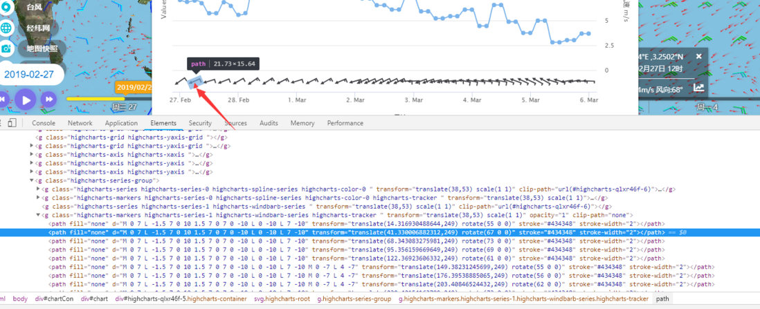
what attributes does this custom icon highgcharts use to implement

what attributes does this custom icon highgcharts use to implement
the arrowhead is drawn, and it is actually drawn according to the arrowhead style. The following examples are for reference
/**
 * Draw the wind arrows. Each arrow path is generated by the windArrow function above.
 */
Meteogram.prototype.drawWindArrows = function (chart) {
    var meteogram = this;
    $.each(chart.series[0].data, function (i, point) {
        var sprite, arrow, x, y;
        if (meteogram.resolution > 36e5 || i % 2 === 0) {
            // Draw the wind arrows
            x = point.plotX + chart.plotLeft + 7;
            y = 255;
            if (meteogram.windSpeedNames[i] === 'Calm') {
                arrow = chart.renderer.circle(x, y, 10).attr({
                    fill: 'none'
                });
            } else {
                arrow = chart.renderer.path(
                    meteogram.windArrow(meteogram.windSpeedNames[i])
                ).attr({
                    rotation: parseInt(meteogram.windDirections[i], 10),
                    translateX: x, // rotation center
                    translateY: y // rotation center
                });
            }
            arrow.attr({
                stroke: (Highcharts.theme && Highcharts.theme.contrastTextColor) || 'black',
                'stroke-width': 1.5,
                zIndex: 5
            })
                .add();
        }
    });
};
refer to the js section of the mixed graph:
https://www.highcharts.com.cn...
Previous: Jquery .html insert data problem
Next: The problem that tables can not be sorted in element-ui
the icon I draw now is a column chart. Due to the change of the column color, the display color of the data point has also changed. How to change it? The code is: plotOptions: { column : { pointPadding: 0.2, ...
makes a chart of dynamically plotting points. The data is 20 array objects taken from the background, inserting one point per second. Click the clear button, and the chart still draws points with the original data taken from the background. But at the m...
when highchart has multiple charts, the mouse hovers over one of the charts, and all charts display tooltips at the same time. And as the mouse moves, the tooltips display content changes. this requirement has a similar demo. https: bbs.hcharts.cn art...
the x-axis is in time format, and there are a lot of midpoints in the picture, so the x-axis looks a little crowded. How to look uncrowded, can you exceed the ellipsis? Ask the god to take a look. Thank you ...
when using highcharts s provincial map, the sample import downloaded from the official website is as follows (Shandong Province as an example): <!DOCTYPE html> <html lang="en"> <head> <meta charset="UTF-8"&...
A pie chart is drawn with highcharts in the project, and the legend component is shown on the right side of the pie chart. Everything is fine on the computer. But on the mobile side, as long as the finger is in the legend position, the page will not be a...
how to add dots (addPoint) to the Highcharts double Y-axis table (multiple axes)? I want to make two curves of temperature and humidity in one table, each using a separate Y axis; the X axis is the date. How to add some through JavaScript? I will no...